Features in SAP Analytics Cloud You Might Have Missed (Part 2)
- Mar 1, 2022
- 4 min read
Updated: Mar 15, 2022

In the previous blog we discussed features like Copy and Pasting Widgets and Pages Across Stories, I’m Feeling Lucky, and Device Preview. If none of these features sound familiar, go check out the first part of the series.
Story Preferences and Templates
As I’ve created multiple dashboards that consume a specific color palette, background, and widgets for multiple clients whether within the same organization or not, I tend to avoid sharing a dashboard because it contains sensitive data. Of course, I don’t want to have to recreate the formatting or spend time teaching others how to recreate it.
SAP Analytics Cloud (SAC) helps you save time in two ways: Story Preferences and Templates.
Story Preferences
Story Preferences can help you predefine settings that you may use throughout your story. For example, I may want to format every page background a light grey and consume a corporate color palette.
Go to the toolbar and under file click on the story settings icon. Click on Story Preferences.

You’ll notice that you have multiple options which include setting a chart color palette, modifying the page background color, and setting the font color to your text boxes.

Now let’s say that we want to switch the color palette for my story. However, I want it to only apply to any new widget that I add.

You’ll notice that as soon as I clicked okay, nothing changed within my existing dashboard. Why? Because this option on applies to any new object that I add to my page. However, as soon as I add a new page, instead of consuming the standard white background, it is now consuming a light blue background that I set via my story preferences.
Now let’s try selecting All Widgets.
You’ll notice that as soon as I click on selecting All Widgets I’m provided a warning message. Why? Because as soon as you use this option on an existing story, it will remove any custom formatting you may have done on a widget. For example, notice how in the original dashboard I had one of my texts white?
Templates
Templates are a great way to share a unique design that you’ve created for your dashboards. A template can be consumed on a new story, existing stories, and by other users as long as you share the template with them.
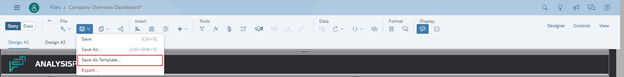
To save a story as a template, click on the save icon and select Save as Template.
You are provided the dialog which will allow you to select which pages to include within your template. Note, like story preferences, saving a story template may remove any specific formatting you may have done.

Upon saving the template, it will appear under the Custom Templates section each time you create a new story. You have the ability to share the template with other users and it will appear for them as well!

Otherwise if you want to apply the template to an existing story, it can be found within the layouts panel. Go to the toolbar and under the format section click on Layouts!
Hint List (CTRL + Space)
As someone who creates a ton of calculations, it can be hard to remember the various calculations that are offered within SAP Analytics Cloud and what parameters are consumed within each formula. SAP Analytics Cloud offers a hint list throughout their application whether you are in modeler, in story, or in analytic design that has always helped me create seamless calculations.
Story Calculations
For example, in story when you are in the calculation editor click on CTRL + Space (CMD + Space for MAC). It will provide you a list of calculations, explanations for the calculations, examples, and a list of measures and dimensions within the model. This functionality continues. For example, as I continue to type out my calculation, I can use the hint list to help me select specific members or to help me complete the calculation.

Modeler
Within modeler the hint list is provided each time you create a formula. For example, let’s say that we are interested in creating a dynamic time calculation where we lookup the previous period value. Once you’ve created the ID and Description of the new account member, click on the formula icon.
Similar to stories, I can use the hint list to pull up all available formulas within modeler. Since we are interested in looking up the previous period value, we are going to use a lookup.
Once I select my measure, and time dimension, it can be difficult to remember the syntax for my time dimension. Let’s use the hint list to select a time member.

You’ll notice that as soon as I use the hint list CTRL + Space, I am provided UI that helps me easily create my dynamic time look up!
Analytic Application
With the introduction to Analytic Application, I find it very difficult to remember which functions I have available depending on the object that I am selecting. I try and avoid referencing the documentation as much as possible.
Within the scripting panel, as soon as I am trying to reference a function, I can use the hint list to pull up every possible function that is applicable to the object.

You’ll notice that the hint list also provides me a short description of what each object does and whether or not it consumes a parameter!


Comments