
SAP Analytics Cloud QRC2 2026: Drag-and-Drop Chart Creation Changes the Workflow
SAP continues to push SAP Analytics Cloud toward a more intuitive, business-user-driven analytics experience, and QRC2 2026 introduces one of the most practical improvements to date: drag-and-drop chart creation within the Optimized Story Experience.
At a surface level, this looks like a usability enhancement. In practice, it represents a meaningful shift in how users build, explore, and iterate on analytics content. The traditional SAC workflow—while powerful—required users to think in terms of configuration panels. You selected a chart, assigned data through structured inputs, and iterated through menus to refine the output.
That model is now being replaced with something more direct.
Users can interact with data the way they naturally think about it: by selecting fields and placing them where they belong visually. The result is a faster, more fluid workflow that feels significantly closer to modern analytics tooling, while still maintaining SAC’s enterprise-grade foundation.
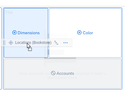


The concept SAP refers to as “Available Objects” is not a new standalone component. Instead, it is the familiar Builder panel, now functioning as an interactive surface for data selection. Dimensions, measures, and calculations can be dragged directly from this panel onto a chart, immediately shaping the visualization.
This seemingly small change removes a surprising amount of friction.
Instead of navigating between sections and confirming selections through multiple clicks, users can build charts in real time. This is particularly impactful during live sessions—whether in financial reviews, planning discussions, or executive walkthroughs—where speed and clarity matter.
What stands out most is how this changes user behavior. SAC is no longer just a place to configure reports—it becomes a space to explore data dynamically.
Key highlights of this feature include:
Direct interaction with data fields
Drag dimensions and measures straight onto the chart canvas
Immediate visual feedback without additional configuration steps
Faster iteration cycles
Swap fields in seconds
Test multiple views without rebuilding charts
Reduced dependency on technical users
Business users can build and adjust their own visualizations
Less reliance on predefined templates or IT-managed content
More natural analytics workflow
Aligns with how users think about data relationships
Encourages exploration instead of rigid design
From a strategic standpoint, this aligns SAC more closely with tools like Tableau and Microsoft Power BI. However, SAC maintains a key differentiator: the integration of analytics with enterprise planning and governed data models.
That combination—flexibility on the surface, structure underneath—is where SAC continues to separate itself.
The broader implication is clear. SAP is moving toward an experience where:
Users are empowered to explore without barriers
Insights can be generated in real time
Analytics becomes part of everyday decision-making—not a delayed output
This feature may not be the most headline-grabbing update, but it is one that users will feel immediately. Over time, it will contribute to faster adoption, better engagement, and more effective use of data across the organization.
Final takeaway: Drag-and-drop chart creation is less about visual convenience and more about removing friction from the analytics process. In doing so, it helps SAC evolve from a structured reporting tool into a truly interactive analytics platform.


Comments